British routines
Our examples are built around UK food shops, workdays, weather, lunches, commutes and suppers that need to happen even when the week is crowded.
About
Wellbeing Kitchen began with one useful idea: fewer anchor foods can make everyday choices feel more generous, not smaller. The project treats meal planning like an edit, not a punishment, and writes for people who want food to feel good on a normal Tuesday as well as a slower weekend.
The site is built like a small food magazine. The pillar article gives the full food atlas. The supporting articles go deeper into themes. The plan pages translate the editorial idea into a 7-day request.
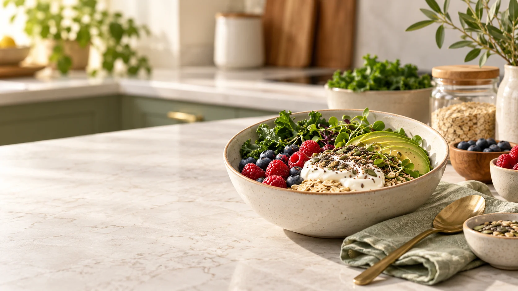
We write about food as a practical lifestyle subject. The tone is modern and useful, with respect for nutritionists, home cooks, London shoppers, active routines and the reality of busy evenings.
The site stays in the space of vegetables, fruits, grains, fish, yoghurt, nuts, seeds and balanced meals. We prefer careful language: foods can be part of a routine, variety matters, and no single plate needs to carry the whole week.
Good structure should make food feel more possible, not less personal.
Our examples are built around UK food shops, workdays, weather, lunches, commutes and suppers that need to happen even when the week is crowded.
We keep the writing vivid but grounded, avoiding overblown claims and keeping the focus on food you can recognise.
The article and request form connect reading with a practical 7-day meal plan, from the first idea to the final review step.
The request flow is written around London delivery details while the editorial voice speaks to Britain more broadly.
Wellbeing Kitchen is for readers who like good food but need structure. That might mean an active commuter, a household planning several meals, someone trying to make lunches less chaotic, or a reader who wants skin and hair articles to stay grounded in food culture.
The site is also for people who enjoy editorial design. Food photography, captions, section labels, typography and a strong footer all matter because the experience should feel like a magazine, not a form with decoration.
The brand voice combines several roles: an editor who shapes the page flow, a food stylist who cares about texture and colour, a planning assistant who thinks about the fridge, and a delivery coordinator who cares about the details in the request form.
Those roles are not presented as separate personalities on the site, but they guide the work. Every page should either help the reader understand the food list, plan the week, or make contact without friction.
A good food site needs more than a strong first screen. It needs real guide pages, a weekly preview, ingredient standards, a clear footer and a route from reading to planning. That structure helps visitors move without guessing where the next useful page is.
This matters because the experience should feel complete. A visitor should not reach a card that leads nowhere, a footer that feels unfinished, or a form that ends in confusion. The content supports browsing, internal linking and clear page intent while keeping the approved visual direction.
Wellbeing Kitchen uses appetite, routine, colour and preparation as its main vocabulary. The writing can be confident and stylish without making promises that food alone cannot carry. That restraint is part of the brand. It lets the site be useful, warm and editorial while still feeling responsible.
The same principle guides the plan pages. The form asks for practical details, not grand claims. The confirmation page records the request. The contact page gives a direct route for questions. Each piece has a job, and the whole site now reads as one connected publication.
A visitor should arrive and understand the offer quickly: ten foods, seven days, a stylish food journal and a practical request flow. After that first impression, the site should reward reading. There should be enough depth for someone who wants the full atlas, enough route-finding for someone who only needs the plan, and enough trust signals for someone checking the footer, legal pages or contact details.
That is the reason the footer is now treated as a real navigation area. It groups the reading pages, planning pages, contact routes and legal pages so the end of the page feels finished rather than abandoned.